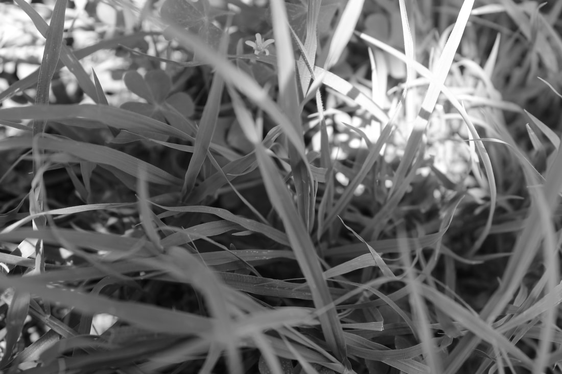
This photo has a mixture of contrast and composition that catches your eye. With the lack of color there are more things that will stick out like texture, patterns, and shapes. If you look towards the bottom part of the photo it gets a little darker so you can easily see the slight texture in the grass, it also has a lot of depth since the grass has a slight shadow. The neat thing about this photo is that one small area of sunlight hitting the grass, that one area is what catches your eye first since its brighter against the dark and moody tones of the rest of the grass.
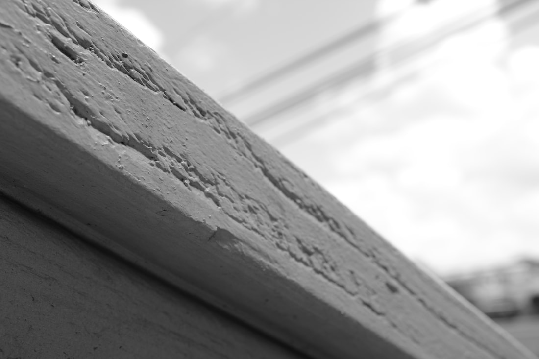
Shooting in black and white can be very confusing and hard since it has a lack of color and you don’t really know how the photo can turn out, one noticeable thing black and white does to photos is bring out its texture. This photograph captures the texture of the wood on the stairs, if this were to be in color the texture probably wouldn’t be the first thing to catch your eye but in the case since there is a lack of color the texture pops more since it has a lot more depth to the indents and lines. There is space to this photograph as well since the background and part of the wood is blurred while the lines are more clear.
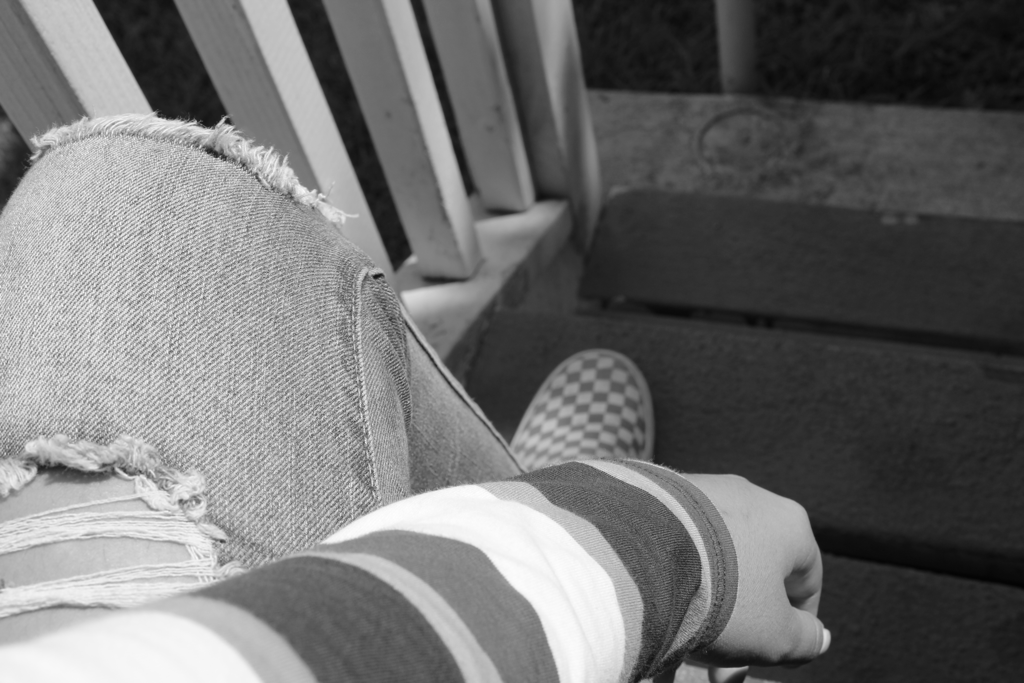
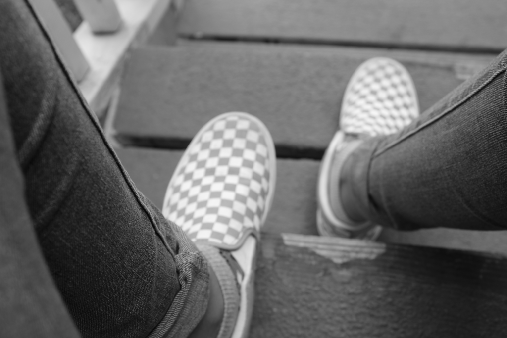
there isn’t much to this photo but contrast like most black and white photos. There are multiple patterns that blend in with the background like the stripes of the sleeve and the checkerboard pattern on the shoes. contrast is the difference between lights and darks and this photo has both light and dark shades that blend well together like some dark parts of the stripes stand out more against the lighter grays.
A more depressing mood is shown with this photo since the focus is more on the darker tones than lighter ones, the focus is on the pant legs and it travels down to the shoe which is slightly blurred but since its lighter it makes the darker gray pop.
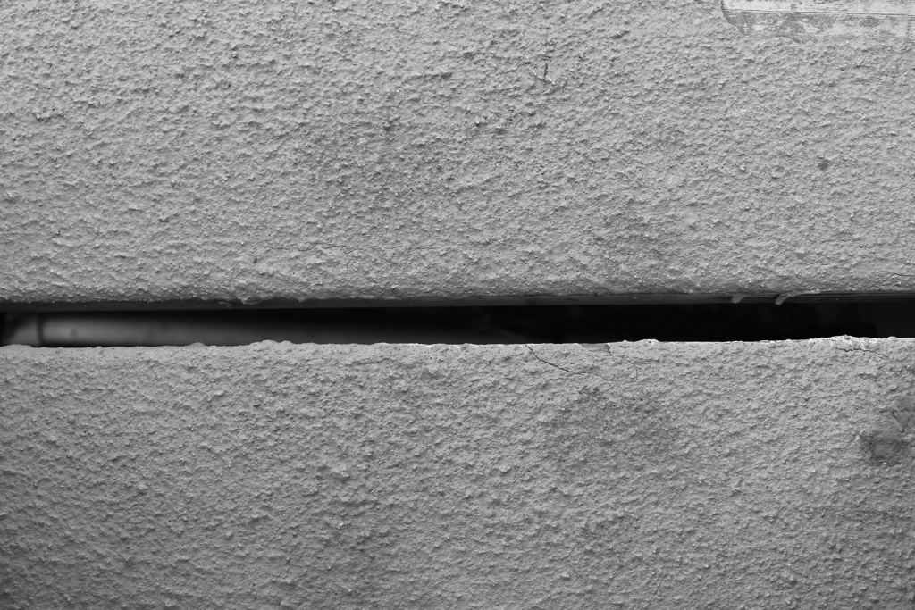
texture and contrast are shown here the most like the other pictures. the grainy texture of the paint against the ground stands out a lot more since the black strip in the middle makes the white look a lot whiter while the black balances it out so its not too bright to where you cant focus your attention anywhere, this photo makes you focus on texture first then it leads to the darker parts of the photo.
